And her (usually) awesome life!

Posts tagged ‘tim holtz’

My Whole Heart

image

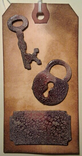
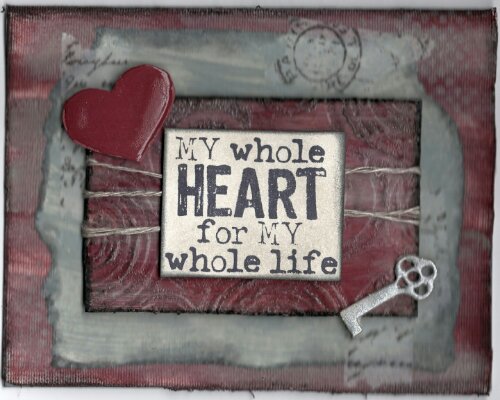
This valentine card for my husband was inspired by Tammy Tutterow’s project in my Creative Retreat class, hosted by May Flaum. I created it using Distress Paints, Liquitex gel mediums, an embossing folder, and Distress Crackle paint. Tammy’s card had a much softer look to it, but I didn’t think it was appropriate for a masculine card. As it is, the Aged Mahogany color turned a bit pinker than I wanted with the grey added over it. I attemped to add just emough black to make it ok. What do you think, does it need more black? (Strange question I know, but black is his favorite ‘color’)

The stamp is from Red Lead. When I saw it, I just knew it would be the perfect stamp for Valentine’s Day. The key and heart are on grungeboard. The key is covered with Pewter Distress Paint, and the heart is colored with Distress Paint and then a coat of Glossy Accents over it. I also used some of my tissue tape. I don’t use a lot of the tissue tape, but I keep trying to incorporate it.

Hopefully he’ll like it! Have a blessed day,
Julie
Friendship Language in Green

image

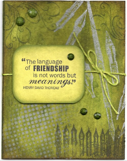
I saw this idea for a gradation of green in my House Beautiful magazine. It was a cabbage with all the green colors getting lighter as it went to the center of the picture. This is my variation of it. First, I colored the background in various shades of green. Then, I used my Distress Paint over my new Tim Holtz stencil for the grey dots. I next tried my new cement embossing powder from Ranger’s Antiquities line. It really looks and feels like cement. It’s quite different than most embossing powders. I did that with a pen nib stamp I got at the convention from Just For Fun. The pen nib stamp at the bottom of the card is another Tim Holtz stamp. The Baker’s Twine is Hemptique that I colored with Distress Ink. The Friendship stamp is Fiskars. I’ve used this stamp set quite a bit and am very happy I got it. I stamped it on bamboo paper from Strathmore. I loved the way it took the Distress Ink color. It just floated on the card so easily. The gemstones are Spare Parts.

I need to give a shout-out to Ranger. I have been enamored with their products for quite some time, but recently had reason to work with their customer service section. It was such a fabulous experience. I’ve been recommending anything by them for a few years, but they’re even higher on the list, if that was possible!

Our good news this week is that Esther got a (temporary) job. She took a year off before going to college so knew she wanted a job. With her special program at school she was in high school for seven years, and she was ready for a break. We were all for that decision because if one is not serious about the education, there is no use throwing the money away. She’s put in a few applications, but nothing substantial. I’ve asked several people to pray for her and her life decisions. I don’t even know what I want to do when I grow up, how is she supposed to?! Her real dreams are in art or in writing, both very tough fields to make money in. Meanwhile, she was thinking to herself Monday morning that there was no way that she’d get a job sitting on her behind. As it turns out, it is possible. She said that’s God’s sense of humor, because not long after she had that thought, and sitting on the couch, the music pastor at our church called. They had a nanny scheduled to work that day, and that poor girl broke her foot. Esther is able to fill in for the couple/few months that that girl will be out. Esther will need a job still after that, but at least it’s something. I don’t recommend sitting on your couch to look for a job, but it does go to show the power of prayer.

May you have a blessed weekend,
Julie

Gears and Faded Layers

image

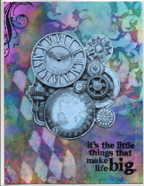
I absolutely love how this card turned out, but oh, it was so hard to make. I was having a mental block yesterday and couldn’t complete this at all. I thought the background was beautiful, and I knew I wanted to use the art acetate gears, but I could not figure out how to put it all together. I finally figured out to put the light blue color background behind the gears and that made all the difference, but still didn’t know how to finish the card. Came home from church/lunch with dear friends and finished it in about ten minutes. I should have just set it aside yesterday but I wanted to finish it so badly.

I think it will make a lovely thank you card, so happy and bright!

Hopefully I’ll make and post a few more cards today so I can post them in my Creative Chemistry 102 class’s gallery – we’ll see!

Blessings,
Julie

I used: Alchohol Inks, and Archival Ink, Tim Holtz/Stampers Anonymous stamps, the Crafter’s Workshop & Prima stencils, Stamp On It Art Acetate, Spare Parts tiny brad, and Pop-up Glue Dots.

A Look Inside: Traveling Lady

image

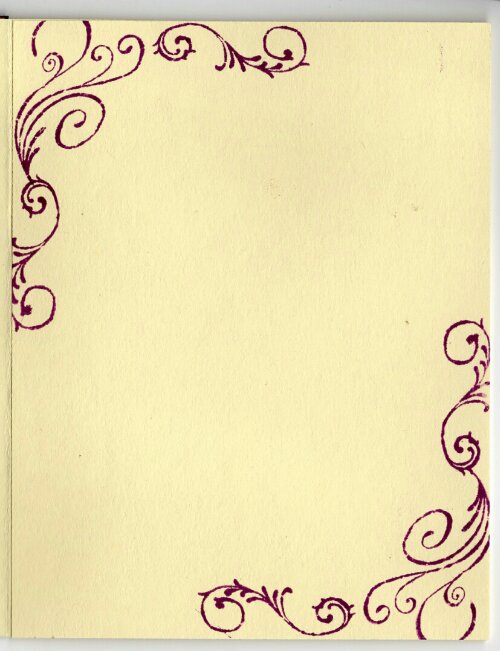
My new Online Card Class: Insider is (naturally) about the insides of cards. I tend to make the outsides that can be used for a variety of purposes and then stamp an appropriate saying on the inside as needed, or I use them as note cards. My MIL, to whom goes a large amount of my cards, also likes to use them as notecards. I decided to update a few cards I’ve already done and put a design on the corners so it leaves plenty of room for a sentiment, or just a note. I used the same flourish stamps by Darcie’s that I used on the outside. I also used the same ink color of Distress Ink as I used in Distress Paint color: seedless preserves. It was a quick fix but I do love how elegant it makes the inside look.

Here’s a reminder of what the outside looks like:

wpid-DistressPaintLady.jpg

I may have several posts as I’m having fun playing with my stamps and ink.

Blessings,
Julie

Stained Bottle

image

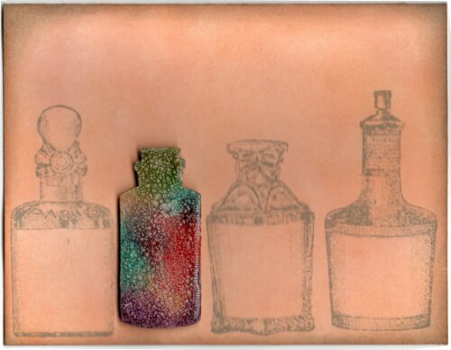
Tim Holtz calls this Shattered Stains Technique. Rock Candy Crackle Paint, Distress Stains and some heat and you can get this really cool stained glass effect. It works a lot better with brighter colors, and several of them, IMO. I love the way this turned out. I’ll post an image below of my first attempt. It worked, but I only had a couple of colors and not the best ones to make the images really pop.

The bottle is from the new Sizzix/Tim Holtz set of Mini Apothecary Bottles. I used Dried Marigold and Tattered Rose Distress Inks to color the background. These two are a perfect blend of colors when going for a light background, but not wanting a solid color. I stamped the Hampton Art bottles in Pumice Stone Distress Ink, and used that color to shade the edge of the card as well.

We’ve thought of several ideas for the inside of the card…’you’re one of a kind’…’you stand out from all the rest’…there’s nobody else like you’…

First attempt:

image

Happily, I can report that my secretary duties at BSF went perfectly last night. I marked all the people there, gave the right sheet and even remembered to sign the paper this week.

Blessings,
Julie

Reading and Watercolor

image

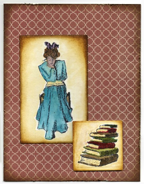
I found these great stamps from Stampland at the convention. I love to read, so they seemed like perfect stamps – vintage images combined with a hobby of mine. I used Watercoloring with Distress Reinkers. I don’t have all the reinker colors, but several more than the two I had last time I tried this technique. It’s a lot better with more colors!

I’ve watercolored with my markers and with the ink pads, and it’s not much different, other than the intensity of the color. I pulled out the dropper and just dabbed it on my craft sheet to get a small dot of color. The reinker ink goes a long way. Even with those small dots of color there was still ink left on my craft sheet after I colored all the images. Tim Holtz says to embrace the imperfections. I confess, I really prefer to stay in the lines when coloring. I kept it and finished this card despite that, but I don’t know if it could ever be a favorite technique. The best part is the vibrancy of color. The background paper is from Teresa Collins Now & Then paper pad.

Recently I read a book that talked about several older mystery books/authors that I have never read. I have begun to try to find some of these books to read. Since they are older books they are harder to find. I did find some through nook and some through my library – love the digital age in libraries and tapping into the interlibrary loans. So far I’m enjoying the books and learning all kinds of (probably useless) information. The two books so far are from 1906 and 1937. They are good books as well as an interesting peek into life during that time. They were written to be contemporary books, but things change and I’ve had to research some things that I’m sure would have been common knowledge then, but not used today – such as American Plan for hotels, and Morocco Bound Book. Google is my friend as I journey back in time through these books.

The next book on my list to read I was so excited to read because all the information said it’s the book where the phrase ‘the butler did it’ stems from. The phrase is purportedly not in the book, but it’s where the play by that name originated. I told several people that and everyone thought it was very interesting. It took telling several people and a couple of weeks before I realized that there’s a reason for the saying and perhaps I now know whodunnit. LOL, I don’t even read the blurbs on books normally because I feel they give away too much pertinent information. I have to resign myself to knowing in this case and just enjoying the plot as it unfolds.

Blessings,
Julie

P.S. American Plan is a hotel that includes three meals a day, and a Morocco Bound Book is a type of leather binding, traditionally goat skin, that is high in quality and could be dyed different colors.

Chemist Resist

image

My next technique to revisit is the Archival Resist Technique. This isn’t my favorite, but I wanted to try it again. I just got this new stamp set from Tim Holtz/Stampers Anonymous. I’ve been wanting more ‘man’ stamps. It’s hard to find ‘man’ stamps that I just must have. I searched a lot at the convention and never found any there I wanted.

This is Archival Ink stamped in the background on glossy paper. Then Distress Ink rubbed over it. The Archival Ink acts as a resist and the colors come through – in theory. I must be doing something wrong because I always get the ink way too dark. On this one I ended up using water on my cloth to remove some of the ink. After that I stamped the main image in Jet Black Archival Ink. I do like the end result, despite my troubles 🙂

Here is a view of the second try of the technique. It’s still too dark, IMO, and the first try was darker than this one until I removed some of the ink. I think I’ll try to remove some ink from this one too.

image

My Bible study secretarial duties went smoothly last night. I had no trouble remembering which form went where. I also managed to mark everyone present – but I did count (twice!) to make sure. Oh, no, I just remembered I was supposed to sign a form :/ And I thought I was doing so well. It is a vast improvment, so I’ll count it as a good night in secretary duties despite that. LOL

Blessings,
Julie

Wrinkle Free Birthday

image

Wouldn’t a wrinkle-free birthday be a great thing! It just refers to wrinkle-free distress, the technique I used on the Artist Trading Card. Tim Holtz‘s new online card class starts next month. Since the next class is predicated upon having taken the first, I thought it would be good to go back and review the videos and techniques. At the (slow) rate I’m going I’m not sure I’ll make it before class starts, but it will be better than not having reviewed at all.

One think I love about this technique, and other techniques using Distress Ink, is how many colors one can use to layer. I used six colors to create the ATC: wild honey, scattered straw, peeled paint, tumbled glass, dusty concord and vintage photo. The birthday stamp is Stampendous. The background is DCWV adhesive mat stack. The gemstones are from the Paper Studio, and Pop Up Glue Dots.

It’s time for another Bible study tonight. Hopefully I will not be as ditzy this week as I was last week. I volunteered to have secretary duties for our small group. Normally I like paper work, but it was like I’d never done any before in my life! All I’m doing is taking attendance on two sheets and putting the correct sheet where it’s supposed to go. Not too difficult, right? I managed, somehow, to have to ask which color-coded form needed to go where because in 20 minutes I’d already forgotten what I was told. I also forgot to mark the last person to arrive as present, even though I knew when she walked in that I needed to mark her down. By the time she put on a name tag 30 seconds later, it was apparently too long for me to remember. Oh yeah, and I had to borrow a pencil because I don’t carry one with me normally. The pencil issue is taken care of. I’ve already put 2 in my bag. Maybe I can make it through tonight with a modicum of sense.

May you have a wonderful week,
Julie

Bird in a Cage

image

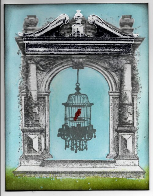
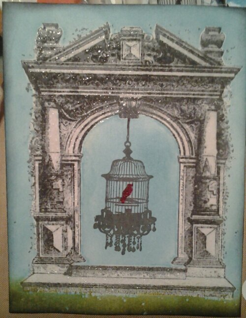
The arch stamp is from Lost Coast. I knew I’d recently purchased the Pediments die cuts from Sizzix/Tim Holtz, and I thought one pediment would fit on top of the arch. It’s nearly perfect. I stamped the arch on the background panel. Then, I die cut the pediment, and stamped the arch onto it. I used the new Watering Can Archival Ink from Ranger, part of the new colors from Wendy Vecchi. I really love this grey color. That is also what I stamped the bird cage in.

I masked the arch and coverd the rest of the paper with tumbled glass Distress Ink. I wish I had thought to put the Peeled Paint Distress Ink on during this layer but I didn’t think of it until later! I covered the arch and pediment with Ranger’s UTEE. I then stamped the bird in a cage by Prima. I will add that the bird cage stamp is not user friendly. It didn’t take ink well. I couldn’t use Distress Ink. The Archival Ink could be used for stamping, but usuallly I can prime stamps with that ink to use other inks. The Archival Ink just rubs right off of this stamp.

Next, I embossed the bird. I discoverd I do not have a good red embossing powder. I have a great deep red, but that was too dark for what I wanted. I do have Distress Embossing Powder, in the red I wanted. It’s what I ended up using, but that really isn’t the right embossing powder for this job. I need to invest in a good birght red regular embossing powder.

Next, I added green on the bottom so the arch wasn’t floating in air. If I had thought to do that before I embossed with the UTEE I wouldn’t have those speckled blue spots peeking through the green. It didn’t bother me enough to start over. I finished it off by attaching the pediment with Pop Up Glue Dots. Here is the panel before I added the pediment:

image

Esther and I decided this was a rather weird card. I only made it this way because the bird cage stamp fit so well in the archway. LOL

Special thanks to my mother for my new keyboard. It’s working very well.

I have a ton of new card ideas. I also need want to make a new notebook for Bible Study that starts again soon.

Blessings,
Julie

Painting Lady

image

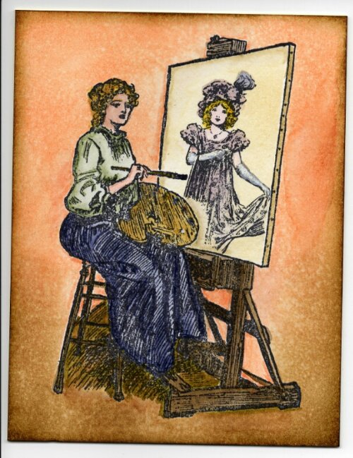
The beautiful Lady at her Easel stamp came from Stampland (she has a name but I don’t remember it). The lady at the convention stamped several different things onto the easel with masking tape sheets (she used Eclipse). I had almost purchased the artist lady stamp earlier in the day, but put it back. When I saw the demo, I was convinced I needed it! I used mask sheets from Tim Holtz/Ideaology.

The girl stamp is from Stamp Camp. I used Distress Inks and Markers to color the images. For some of it I used my Tim Holtz water brush. I stamped it on the new Distress Watercolor Cardstock. I used Jet Black Archival Ink to stamp the images so they would be waterproof.

image

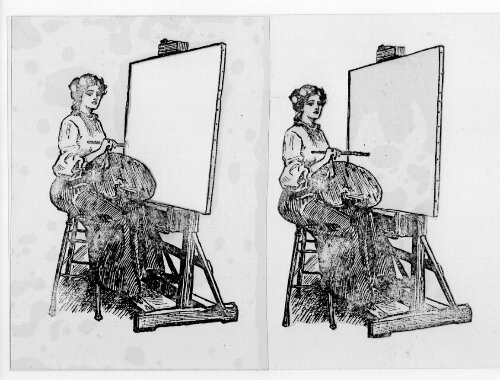
Tim Holtz used mask sheets in his August Tags which in turn inspired me to use mine. I have had my mask sheets for a few months but didn’t know quite what to do with them. The Artist and her easel is a perfect stamp to use the masking sheets on. The mask on the left is card size with the easel cut out. Now any stamp can be stamped into that spot, regardless of the size. I used StazOn ink to stamp on the masks. According to Tim Holtz, a solvent ink is what is required for it to be permanent on the masking sheet. Since this is the case, I used Archival Ink to stamp with on my card because I could wipe the Archival Ink right off of the mask. The right side mask is the cut out of the stamp itself, so I can do backgrounds. I have never done a lot of masking techniques, (and probably still won’t!) but it’s nice having an easy way to do that. You can see I didn’t worry too much about getting a perfect image with the stamp on the mask sheet.

Blessings for a joyful week,
Julie

Tag Cloud